This case study is to redesign CNN’s current website, to give a fresh look, solve some issues with the interface, improve the structure, and simplified the interface for better usability.
The redesign of this project is to practice my skill in UX and UI without any restrictions, the output of this project is not the best version of CNN’s website interface, but it shows that there is still a lot of room for improvement.
Typeface
Merriweather for headings and body text to give a classic look of a news paper on a digital platform, as it gives good readability, and Inter for secondary Typeface used for the navigation links and tags to keep it minimal and good user experience.
Icons
The icons are picked carefully to match the flat aesthetic of the web app.
Colours
The colours are still the same to keep the brand colour identity.
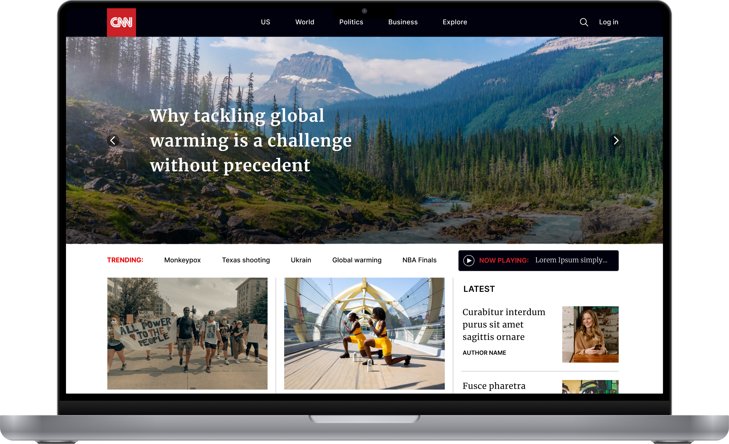
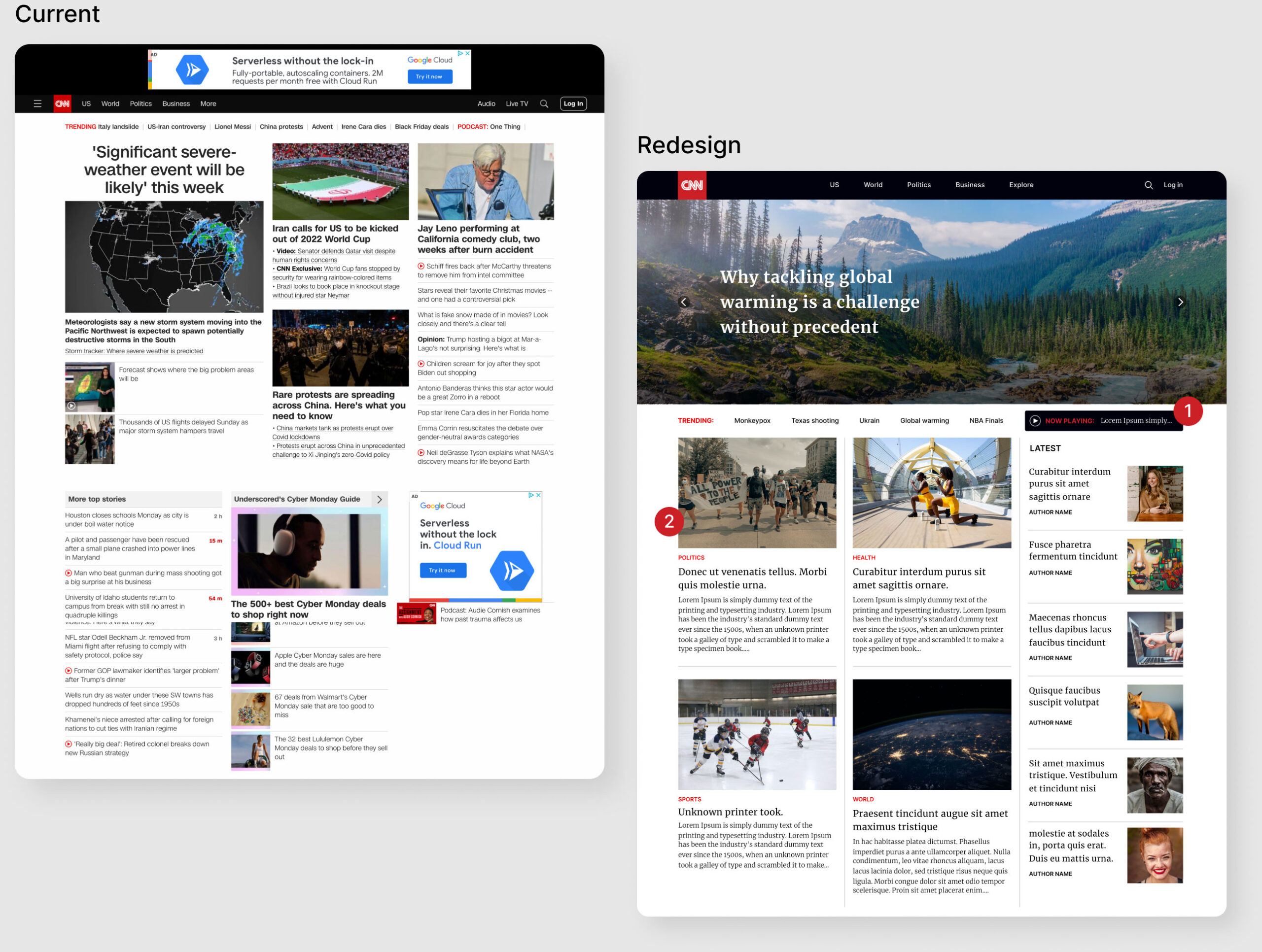
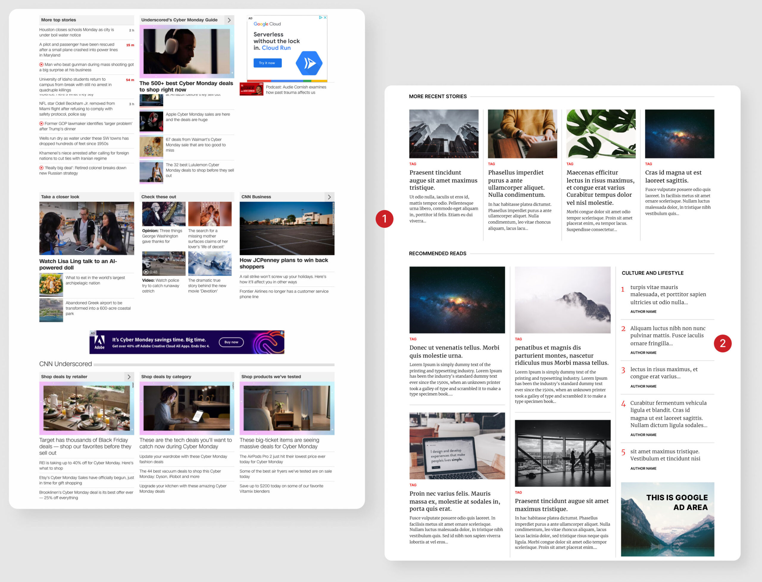
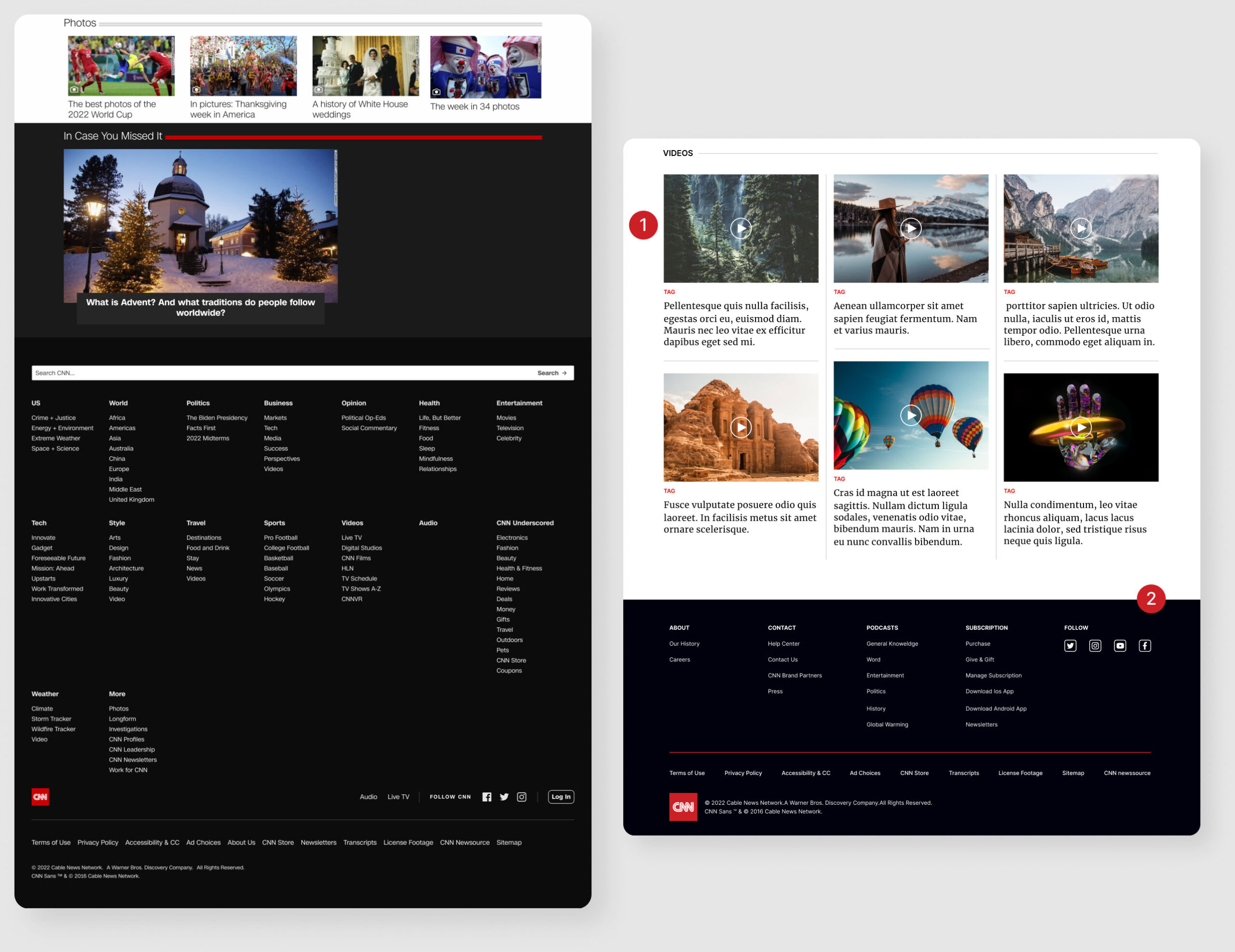
The Redesign
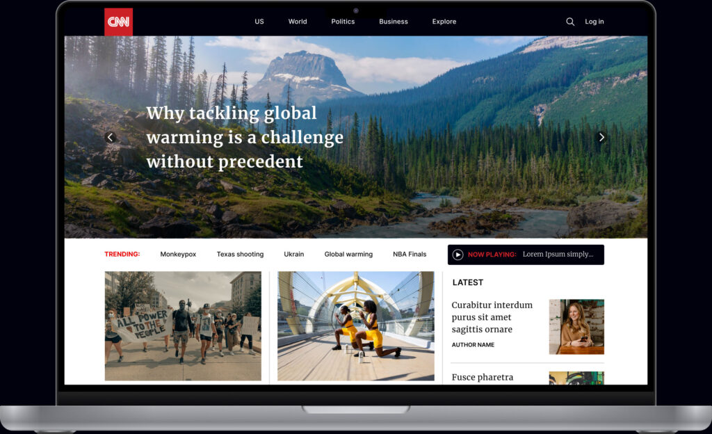
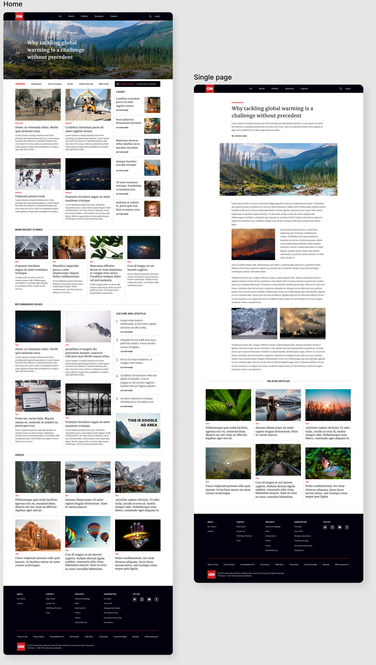
1. Added a prominent play button for easy access to watch the news on the live stream.
2. Uniform size of the components and a divider for each stories to give a simple flow of reading.
1. Breaking each section with a prominent title
2. Aside for maximizing the section and room for more articles in category
1. Added a play button to make it clear to the user that this section focuses on videos.
2. Simplified the footer and make it less busy but still informational.