Product Design
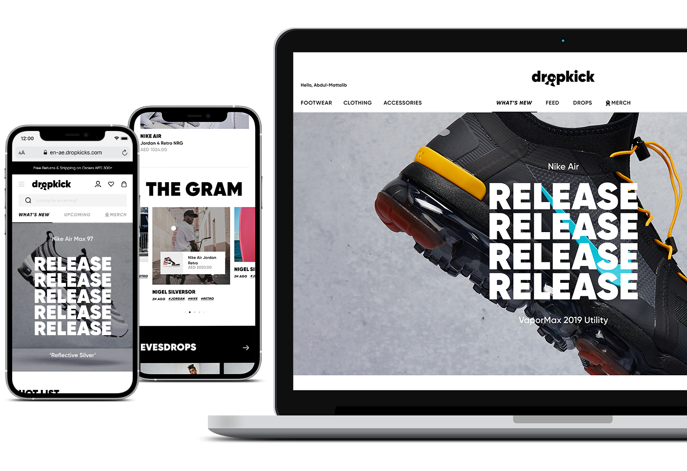
Create a platform for gen Z to co-curate what it means to be fresh. The first e-commerce shop co-curated by you, for you.
Typeface
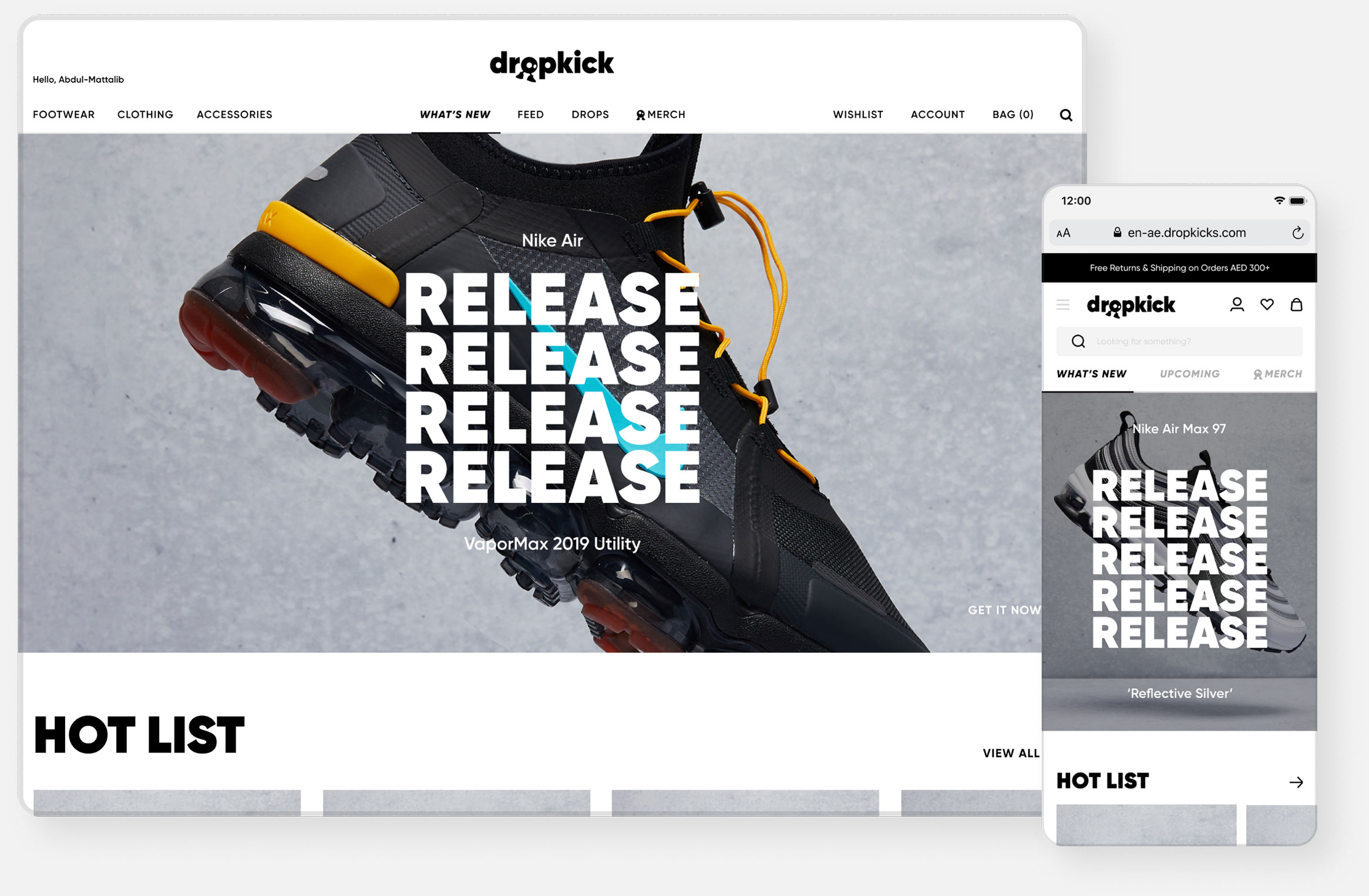
Headlines are set in uppercase Gilroy Heavy for Bold & impactful statement
Copy uses Gilroy Semi Bold balances the heavyweight, the logo, and the headline type style.
Icons
Cohesive and Balance
Home
The curated overview of everything fresh
Product Launch
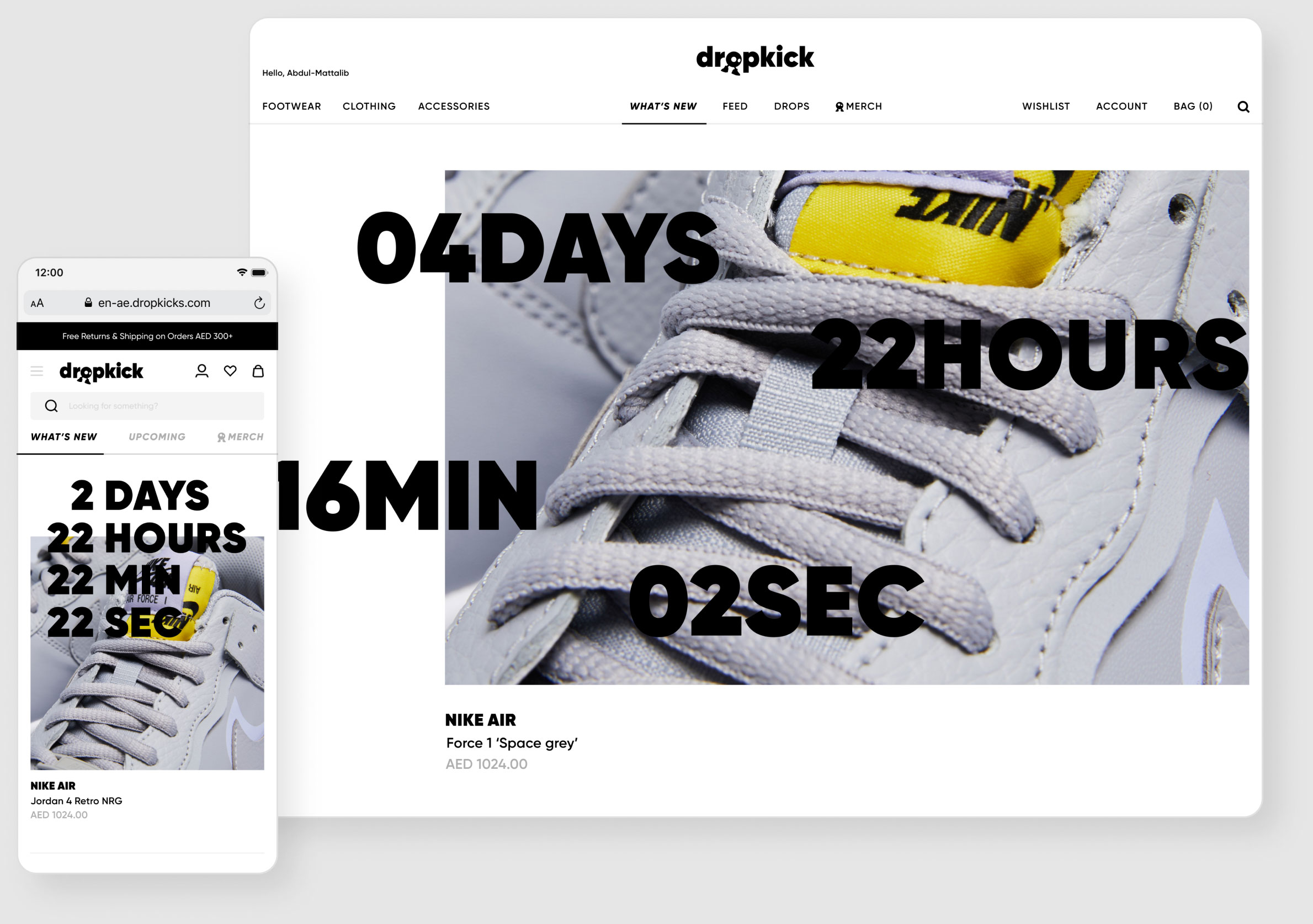
Highlights a single product that will be launched soon. The image is almost full width as to really build the hype around the product. The countdown is included to provide a sense or urgency. A user can either set a reminder for the launch (which should trigger the day before) or go to the overview of all launches.
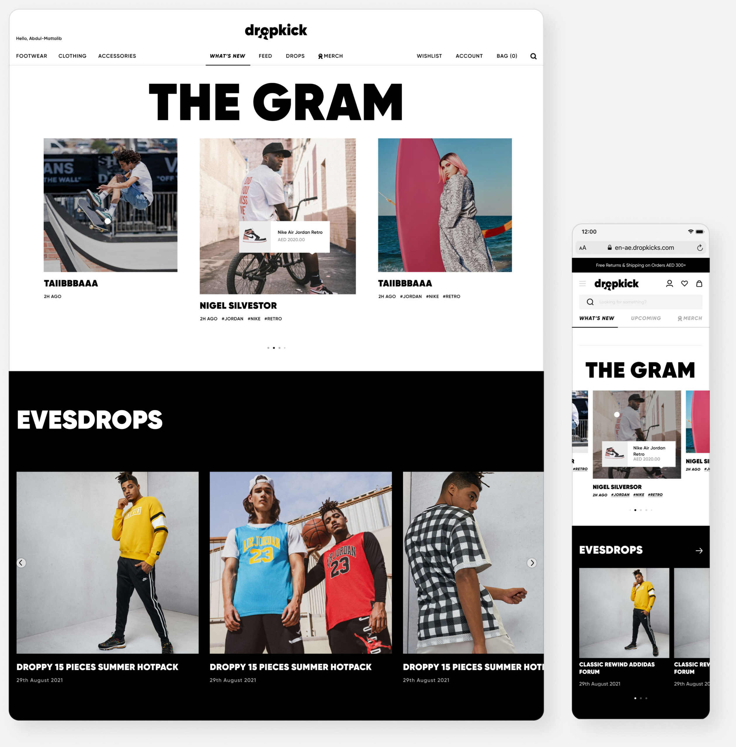
The Gram
Images copied from Instagram to the website. Clicking the image will show the attached products which can lead to a product detail page.
Evesdrops
Get to know the one behind Dropkicks dope design, news and releases.
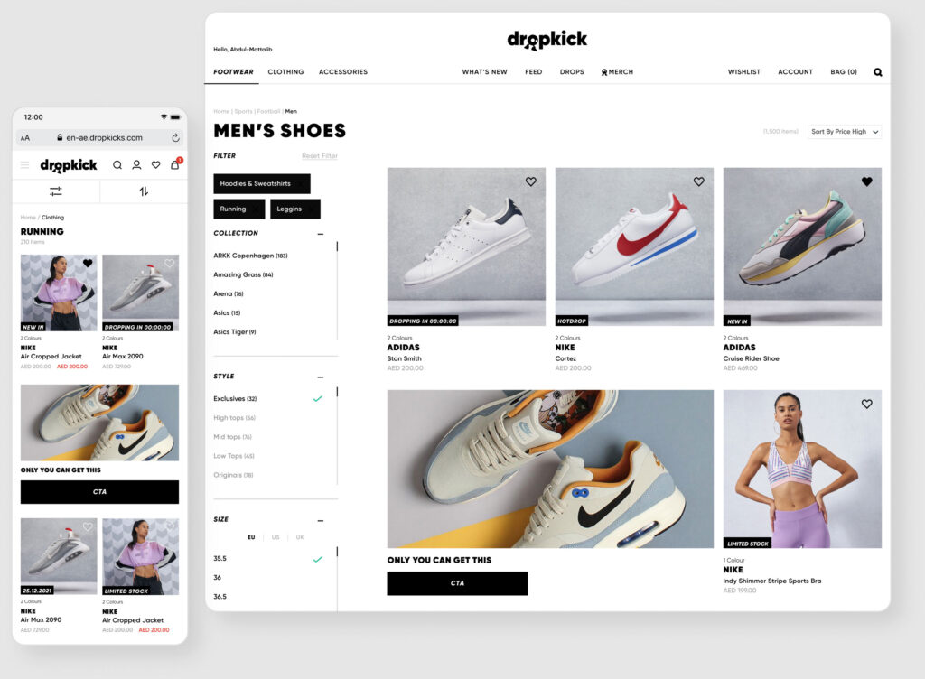
Product Listing
Product Detail
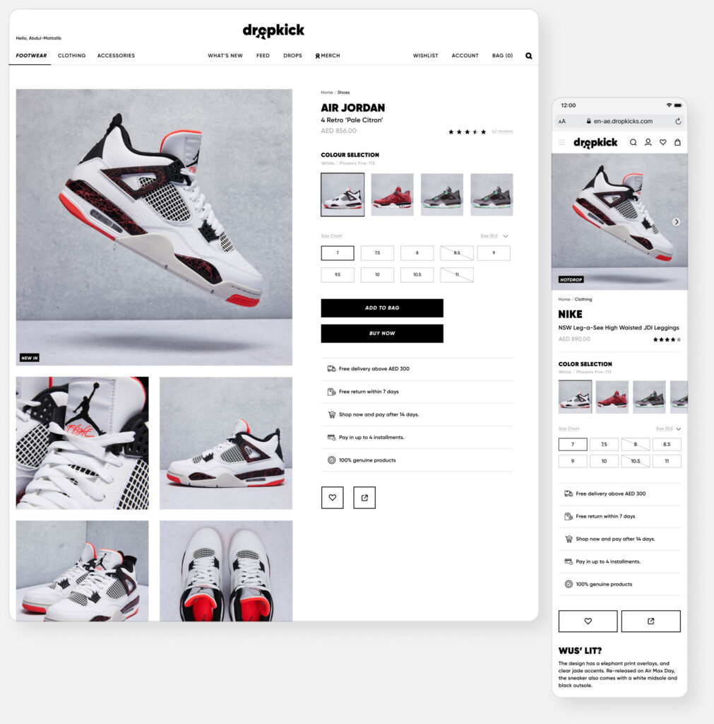
Championing the product with big images combined with the necessities to direct users into a simple checkout.
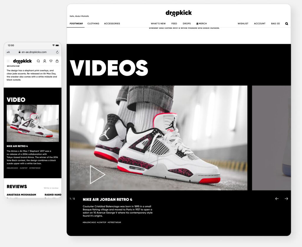
By you, for you in the form of videos that can be used for reviewing purposes through influencers, Dropkick curators, and your peers.
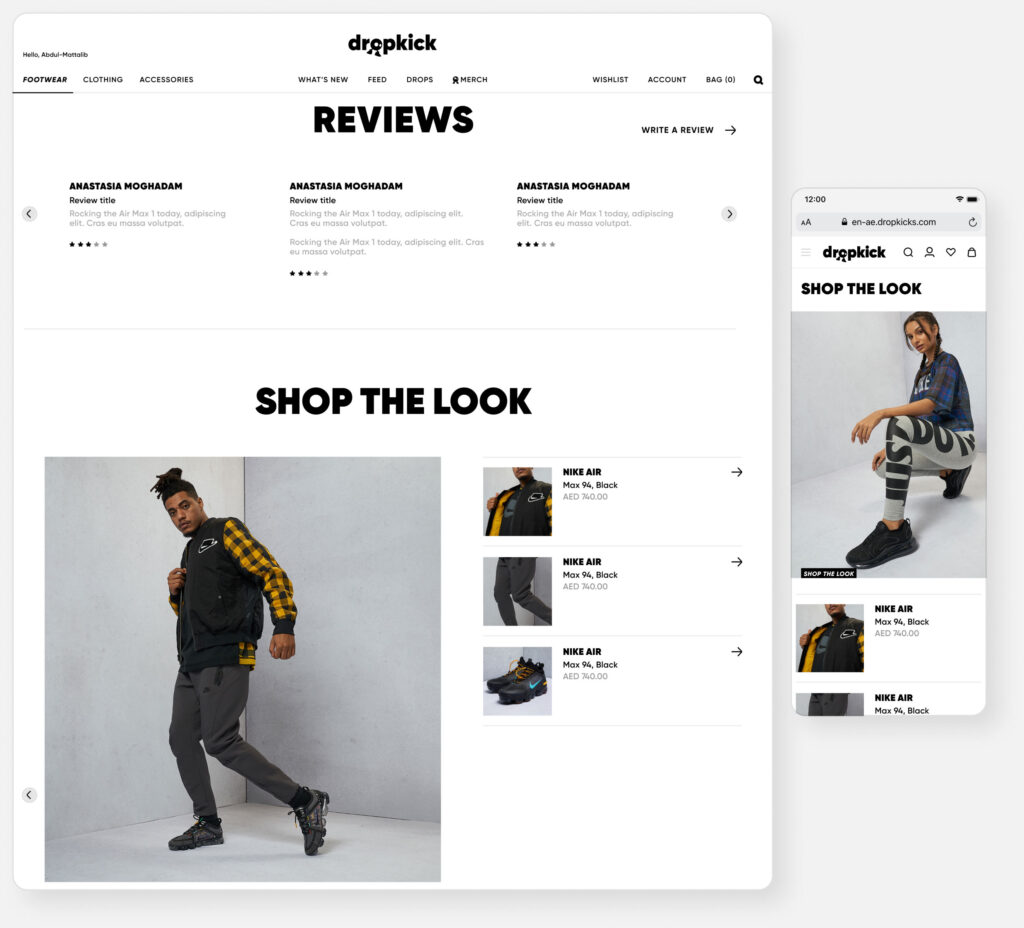
People often don’t know what they want or how they should combine something, showing looks can both be inspirational and playful when used on the listing pages.
Taking into consideration that many journeys start on a product detail page, the tags can work as a form of searching throughout the whole platform.

Checkout
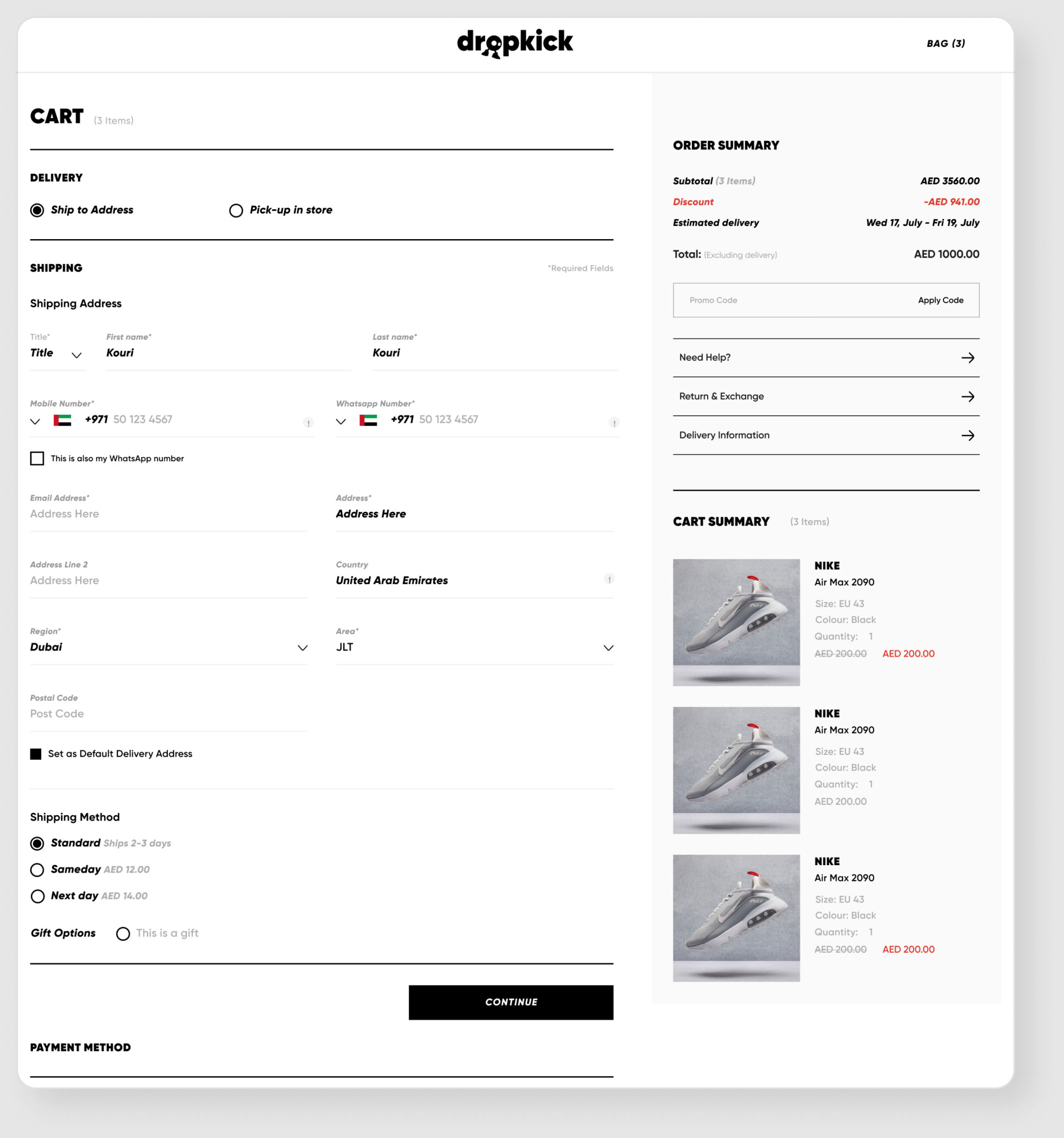
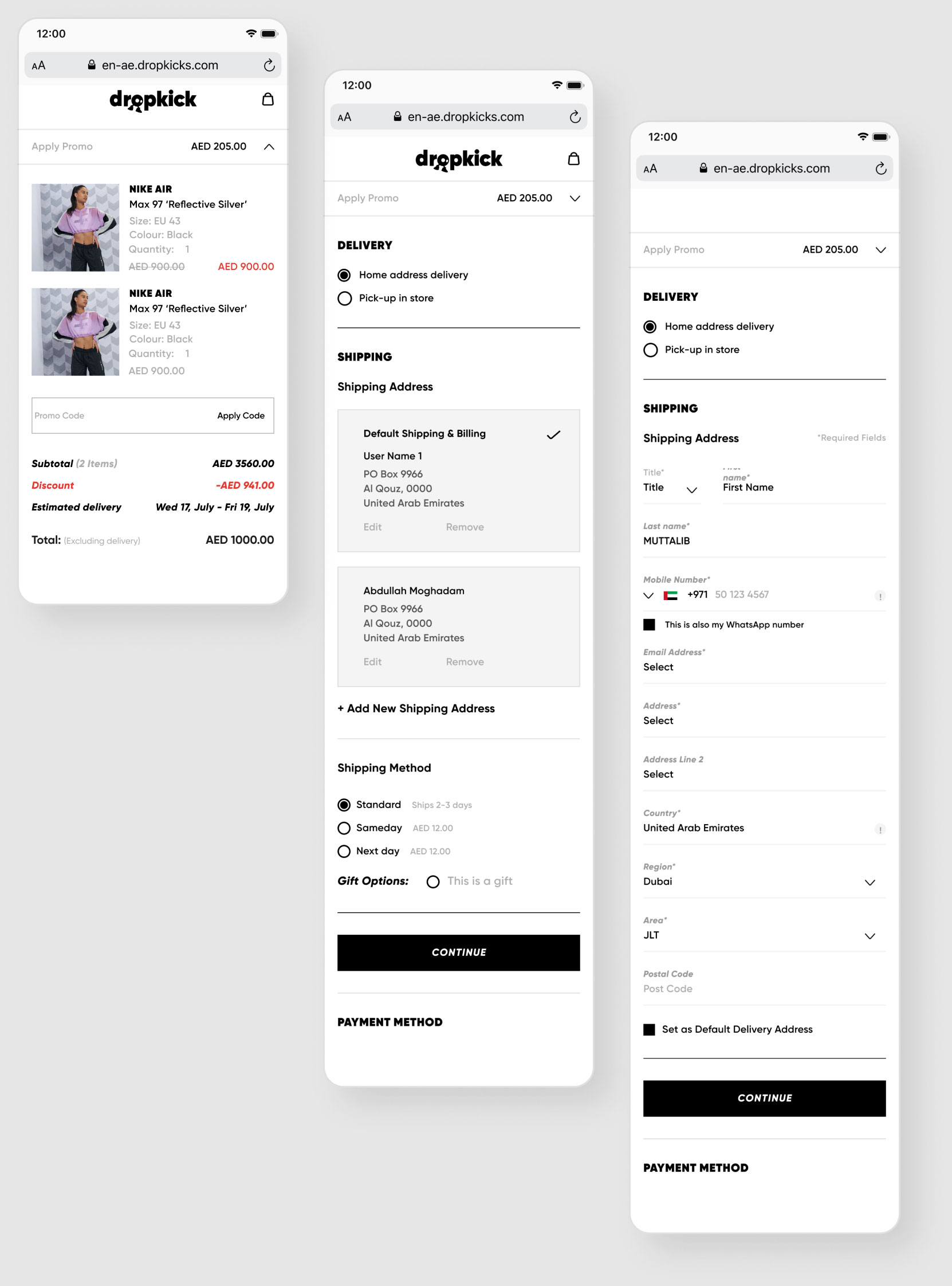
With the increase of screen real estate on desktop the checkout is a simple one-page form to allow for a smooth experience.
The mobile checkout is split up into a series of simple steps which need to be filled in once. On future visits the checkout is pre-filled allowing for single-step checkout with the option to change your details.
