The current Freedom app tries to stay minimalistic and simple, however, in doing so, it makes it dull and difficult to understand. As a user, there are some issues that need to be solved in navigating the app and its flow, I restructure the home page and make the navigation more prominent so that it can be accessible all through the app. Giving an emphasis on the Data plan, data usage credit balance, and Call and text as the main feature of the app and also showcasing the offers and promotions for user engagement.
The redesign of this project is to practice my skill in UX without any restrictions, the output of this project is not the best version for Freedom’s user experience and its flow, but it outlines the areas that need to improve for a better user experience.
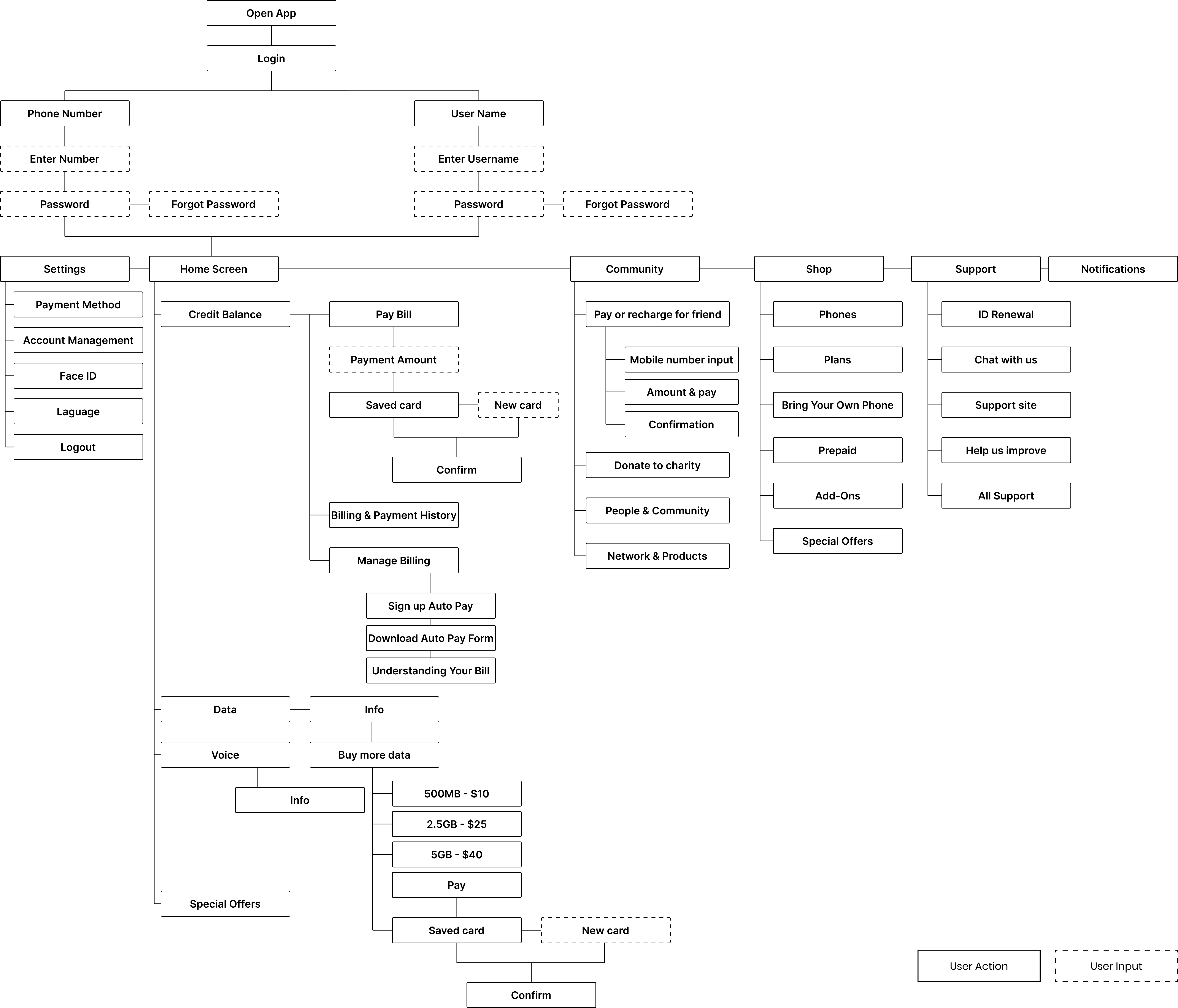
New userflow
Home Screen
Current
Redesign
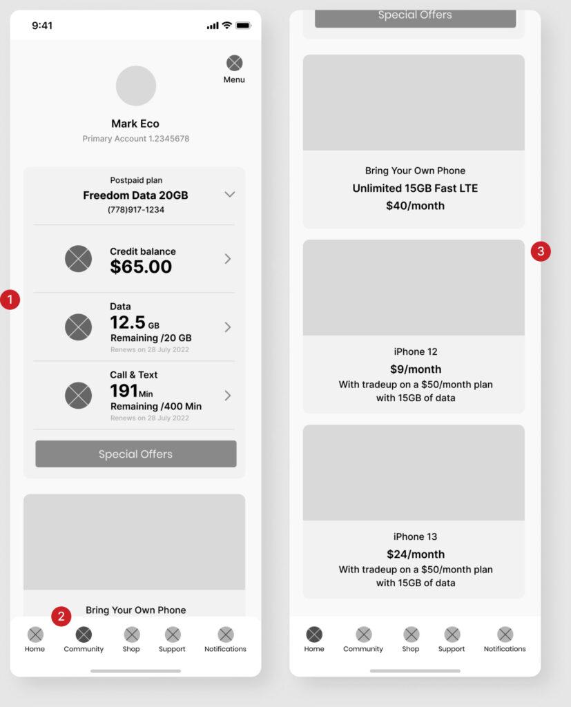
1. Show the most important information that the user needs to see when they open the app, i.e Type of plan, credit balance, data available, and call and text
2. Bottom navigation for easy access
3. News and promotion cards
Payment Method
Current
Redesign
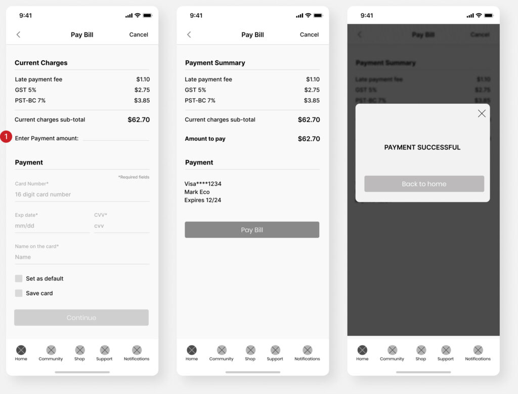
1. As the user goes through the payment method and once input their payment credentials, the user will also have the option to save and set it as a default to have an easy flow on the purchase or payment
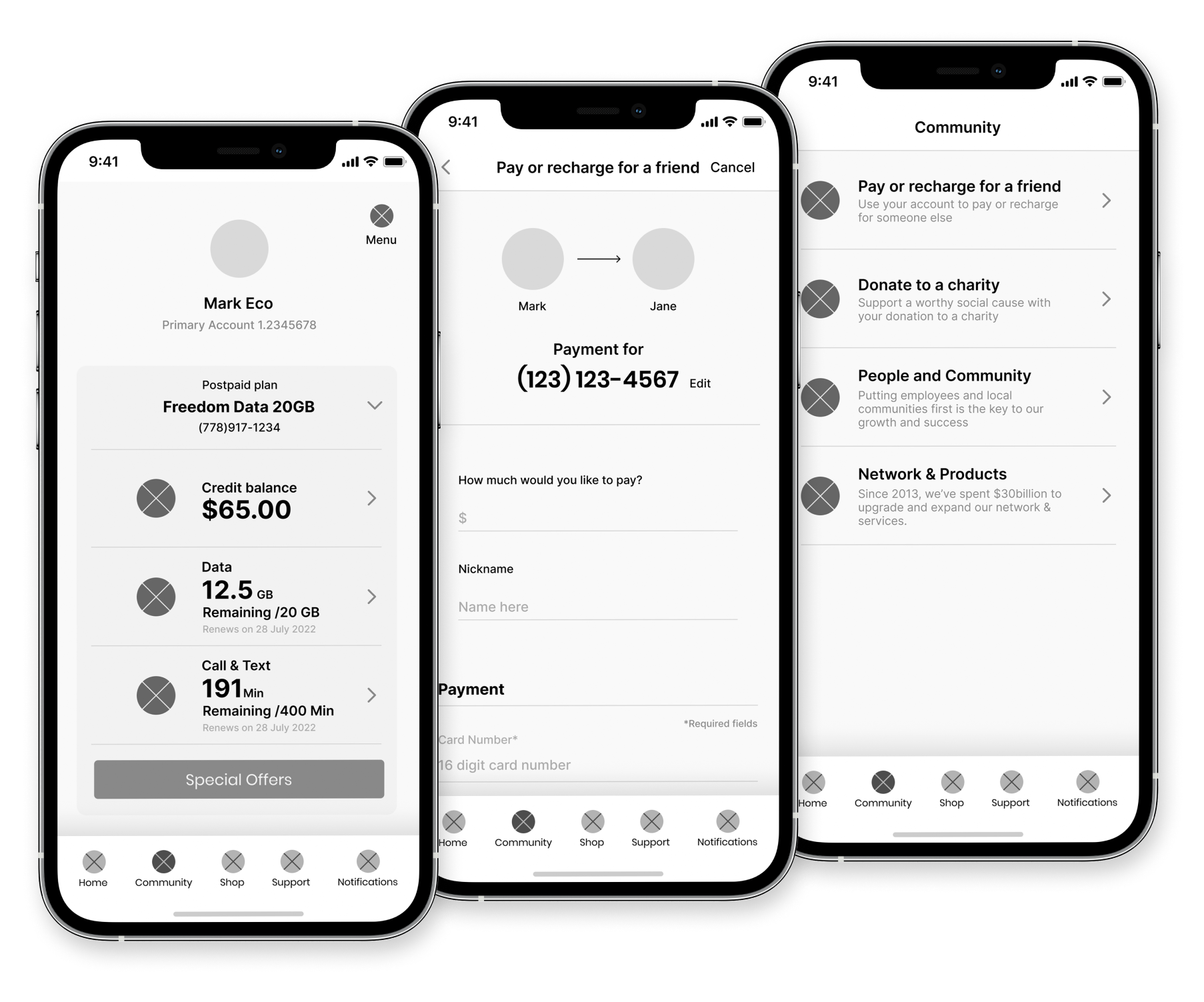
Pay or Recharge for a friend (added feature)
Community page added to show brands’ social responsibility and ethics