Logo

Product Design • UX • UI

TradeUp

Preparing you to trade cryptocurrency effectively with simplified simulation-based learning.

img

In 12 weeks' time, from brainstorming to the final product, my team and I created Tradeup.

TradeUp is a mobile application helping users learn how to trade cryptocurrency before risking real money by buying and selling using mock money in real-time market data. The app has all the essential features simplified into a user-friendly guided experience, including the most common types of trades, price alerts, charts, and order books – making trading easy to navigate and analyze for a beginner.

The Problem

Gen Z spends an average $6,120 annually on crypto, while millenials spend $8,596. Ironically, Gen X remains the highest spending population – $9,611, while Boomers spend $4,567, despite making up only 7% of total traders.

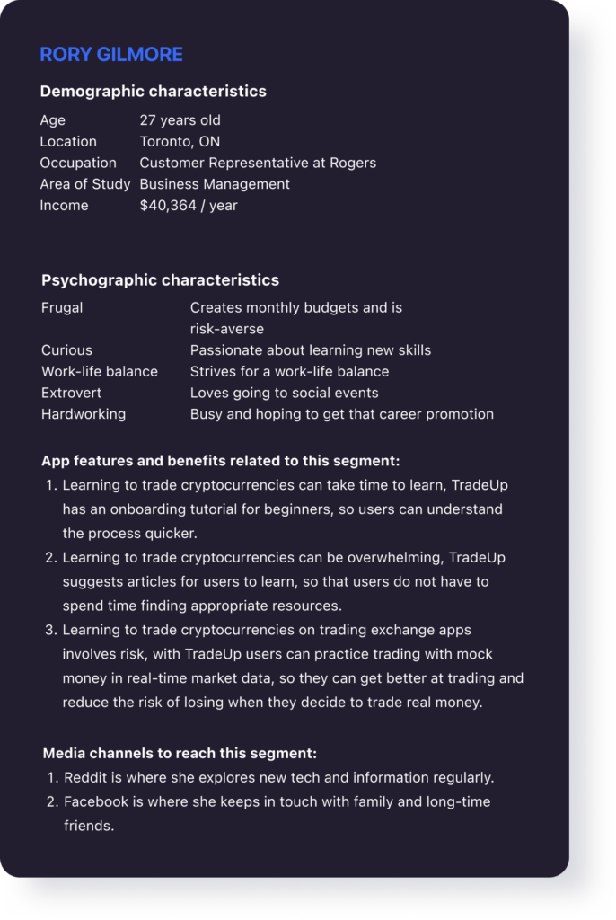
New traders are overwhelmed
Overloaded with the complexity of learning and new information influencing trading

Investment fear due to lack of funds
Reluctance in risking money for crypto trading due to limited finances

Lack of learning through experience
Lack of exposure to trading due to difficulty in learning and risk aversion

The Solution

We created TradeUp to fill this lack of experience. We know that practice ultimately leads to improvement.

We gathered the fundamental features of trading, simplified them into an intuitive interface and set in real-time market data. We want our users to learn from real-life market scenarios, further support them with educational resources, and capitalize on mastery learning by keeping users engaged by rewarding their performance.

Our goal is for users to feel at ease learning crypto trading, test their knowledge in a simulation of real market scenarios and become confident and effective traders.
img

User Persona

img persona 1
img persona 2

User Flow

To start defining the interaction design and the information architecture of the app, we created the primary user flow. The user flow helped in the discussion with developers to clarify the main goal and features of TradeUp.

Wireframes

img

Homepage

The homepage gives the user a glimpse of various features of the app. These include featured resources, trending coins, and the top traders in the leaderboard.

img

Market list and Crypto detail

A list of cryptocurrencies to trade is shown on the Market page. By selecting a coin, the user is directed to the Crypto Detail page which shows the information on its performance using a chart and order book.

Order status and Coin info

Aside from the Chart, the Crypto Detail page contains other pages including Orders and Coin Info. Orders contain the status of orders, while the Coin Info contains basic information about the coin.

img

Buy and Sell

The Buy and Sell page is used to set trade coins. The user enters values depending on their strategy. It also contains trade recommendations to help a beginner explore strategies.

Resources

The Resources feature lists articles related to Cryptocurrency and learning to trade. The user has also suggested an article with every successful order to encourage learning.

img

UI Kit

Typography

SF Pro was designed specifically for screens, with a large x-height making it comfortable to read big quantities of information involved in trading. Since the app includes plenty of numbers, SF Pro numerals’ similar baseline to text makes the style consistent.

img

Colours

The color palette consists of dark navy blue as the primary color, denim blue as secondary, and blue as tertiary color. Pastel red is used for error, gold orange for warning, and kelly green for success to guide users. Furthermore, three gradients of gray are used to display the content.
img_colours

Icons

SF Pro was designed specifically for screens, with a large x-height making it comfortable to read big quantities of information involved in trading. Since the app includes plenty of numbers, SF Pro numerals’ similar baseline to text makes the style consistent.
img_icons

Buttons

The color palette consists of dark navy blue as the primary color, denim blue as secondary, and blue as tertiary color. Pastel red is used for error, gold orange for warning, and kelly green for success to guide users. Furthermore, three gradients of gray are used to display the content.
img_button_big
img_button_medium

Badges and Notifications

img_badges
img_buying options
img_warning
img_order success